resources

articles
homework help
columns
the help desk
case study
pet peeves
|
Case Study : Analysis
This analysis is to show and explain some of the major flaws in the mock bad page.
All of the points discussed are all basic HTML design violations recognized by many web design
professionals. We have included some links to other areas for further explanation and help.
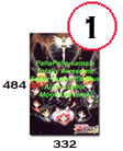 |
1) The title banner is too large.
The banner with the title is 484 pixles by 332 pixles and is 52KB in size.
Not only will this picture load slowly for most phone-line modems, but it's vertical
shape makes it look out of place and distracting to the rest of the page.
It would better if the picture was less than 40KB and more horizontal in shape.
|
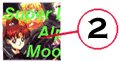 |
2) Hard to read text in picture.
Designers for ads and other print media will always tell you when placing
text over a picture cover as little of the person in the picture as possible
with text. This picture covers a good portion of characters in the picture
and also covers their faces. (A big design no-no) This makes the text hard
to read and makes the use of a picture with characters in it pointless.
|
 |
3) Image is out of place on page.
If you look closely at the title banner you will notice it's actually a picture
laid over a white background with shading behind it to give it a slight
three-dimensional look. If this page used a white background instead
of a red one, the banner would look much more like a part of the design
of this page. Rather than something slapped on it.
For help with graphics see our list of
graphics help pages.
|
4) The Page Title.
"PallaPalla-sama's Totally Awesome Super Duper EX Plus Alpha Sailor Moon Universe"
Is really a too long of a title for a webpage. It's always a good design practice
to come up with a catchy, shorter title for a webpage. A title that relates to the
topic of the page, plus will be easily remembered by visitors. This helps promote
more hits because people will at least remember the title of your site if they
forget the address so they can find it again through a search engine. It's also
a bad practice to include superficial words like "Awesome" and "Super" in a page
title.
|
 |
5) Poor choice of colours.
A red background with lime green text foreground is a poor choice of colours
on a webpage. These colours make the text difficult to read, creating
inconvenience for visitors. Experiment with colours more to find the
good combinations. Usually go for something not too bright for backgrounds or text,
go for pale backgrounds with dark text. Plus, don't be afraid to use the old
standbys: white background with black text foreground or
black background with white text foreground.
For more help choosing HTML colours, check out Webmonkey: Color Codes
|
 |
6) Broken Pictures.
A very common mistake is uploading a webpage and not viewing it once it is loaded up.
This is the main reason for finding "broken images". The designer could have missed a
picture while uploading the site on the internet. Another possible mistake, the filename
in the IMG tag includes either a drive name or incorrect directory name.
(For example: A:\pic.jpg) Remember not to use drive names for filenames on your
website. Visitors do not have access to your disk drives. Besides, trust me, you want
to keep it that way. The most important rule when creating a website: "Test it, test it and
then test it some more!" Testing the site by viewing it at it's web address
would help to find such mistakes and allow a designer to correct them before
potential visitors either complain or just decide to never come back.
In addition, if you view the source code of that mess you will also notice Palla setup a
fake direct-link for the so-called "Sailor Satan" picture. This is to show what can happen
if you are lazy enough to steal someone else's bandwidth. If the owner of the web site
you direct link moves the pic, moves their site, or shuts down, the picture on your site
becomes broken. Thus, you should get permission to use the pic, save it, then upload
it to your own webspace. It makes your site much more reliable, plus you don't get into
trouble for stealing bandwidth which often can result in your site being shut down
if someone reports you. That's a standard clause in most webhosts Terms of Service.
|
 |
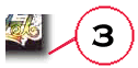
6) Incorrect or Altered Picture
Using an incorrect picture is every bit as bad as using incorrect information.
While this may look like a picture of Haruka from Sailormoon it's actually
a picture of Yui Hongo from another anime series, Fushigi Yuugi. Despite some
similarities, it is incorrect to use this pic as their are also a lot of differences
in the two character's appearance. It is even more of a mistake to try and alter the
picture to try and convince visitors it is of Sailor Uranus. If you can not find a proper
picture of a character, it is better not to include a picture at all rather than
trying to pull a stunt like this.
|
7) Page Structure/Proper use of a Index Page
There is a reason why the opening page of every website in the world
is set to index.html. For the same reason it is also called an index!
The opening page of a website is meant to act like a table of
contents for a website. It should always include the title,
and links to subsections of the site which are created on other HTML files.
Besides that it should only be used for very important items
like introductions to the site, update information, and any advertisements.
Instead, the page includes an information section and a "Sailor Facts" section all
on the opening page. These should be replaced with links to new HTML files
containing this content. This allows for a faster loading, easier to
use webpage. It is really important to properly structure the index or
opening page of a website because on the internet, first impressions means
everything.
|
8) Incorrect Information
There is something wrong in just about every paragraph of this site,
everything from made-up names to rumors. We will save most the details
about what is wrong with the information for the mock review section.
You can find further help with Sailormoon Information in our
Articles Section.
Also try visiting some of the recommended pages we have
linked in our Recommended Section
|
|